So, you’re on your way to becoming a property mogul, huh? Good for you! But here’s the thing – anyone can buy houses. The trick is making your properties memorable, and that’s where branding can come in. So should you do it? In short, yes, but before you start plastering your logo across every available surface, let’s talk about how to weave your brand into your interiors without turning your rental into a walking advert.
Pssst, being a newbie investor can feel very overwhelming – we know all too well. If you don’t nail your brand right away it’s not the end of the world having your first few properties not consistent as you work out your brand style.
Let’s dive into the Dos and Don’ts of branding your property empire while keeping things stylish and tenant-friendly.
Understanding: The Target Market
As with most property decisions, you must first know who you’re targeting, and this also stands for branding your space.
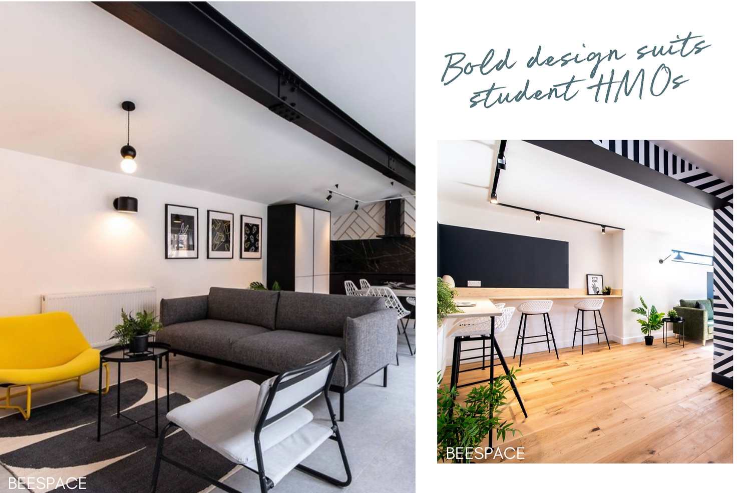
Student HMOs are arguably the easiest to brand as the space isn’t as personal, due to them being there for usually less than a year, so you can have more fun and be more bold with your choices. Professional HMOs would need to be paired back further but you can still be confident in your branding.
However, buy to lets are a tougher nut to crack. Tenants aren’t going to appreciate too much personality imposed on their space. But that doesn’t mean you can’t bring a little of your brand flavour into kitchens and bathrooms with colour schemes. A bold backsplash or a bathroom accent wall can do wonders to give your property some identity without being overbearing.

Struggling to define your target market? Get some guidance from our handy download here.
Key Colours: The Secret Sauce
You love your brand colours – great! But please, for the love of all things tasteful, don’t go painting the kitchen cabinets neon green because it matches your logo. Subtlety is key here. Instead, think about working your brand colours into easy-to-change items like paint, soft furnishings, or accent pieces.
Throw pillows, curtains, feature walls – these are all low-risk areas where you can let your brand shine without being overwhelming. Why? Because if your brand suddenly pivots, you don’t want to be stuck with a lime-green kitchen from your “edgy phase” when you’re now trying to market “calm, sophisticated living.”
the modern landlord’s top tip: avoid branding anything expensive to replace, so that if your brand takes a new direction, you’re not tearing up the entire property just to keep things consistent.
The Little Details: Motifs & Icons
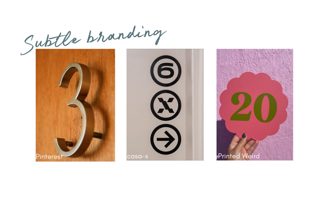
You want to leave your mark without literally leaving your mark, as your brand is more than a logo. Subtle nods such as vinyl stickers on doors can add personality without smacking people in the face.
It’s like wearing a designer jacket with no flashy logos on the front – people know it’s stylish without needing to see the label.

Communal Areas: Your Branding Playground
Communal spaces are where you get to have a little more fun. These areas aren’t as personal as individual living spaces, so you can afford to let your brand really shine here. Paint that hallway a bold brand colour or throw in a mural that screams your vibe (student HMOs recommended here only though!).
Think of communal areas as the stage where your brand gets to take a bow, while keeping the actual living spaces calm, neutral, and tenant-friendly.
Consistency Is Key
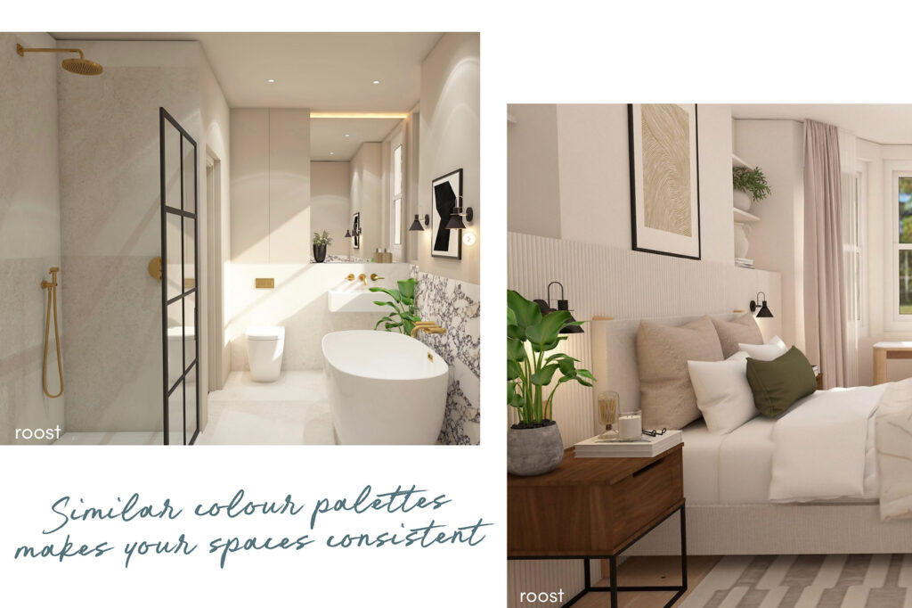
Whether you’re decking out a luxury flat in the city or giving a facelift to a suburban semi, you want people to be able to spot your properties from a mile away – just by looking at them. Think of your properties like your Instagram feed; they need to be consistent. Sure, it might take a while to nail down your style, but once you do, stick to it like glue. It’s that consistency that will help people say, “Ah, yes, this is definitely one of [Your Brand]’s properties!”
You don’t want your portfolio looking like a mish-mash of styles – find your groove and stay in it.
the modern landlord’s top tip – slap a sign with your brand on the scaffolding or fencing while you’re renovating —people walking by will start to recognise your name, and who knows, you might even attract a buyer or tenant before the paint’s dry!

So, are you ready to build your property empire and brand?
If you’re sitting there scratching your head, thinking, “Where do I even start with branding?” don’t panic. We recommend checking out Simon Sinek’s theory via this blog. The guy’s basically the branding whisperer. His theory? The most successful brands don’t start with fancy logos or catchy slogans—they start with ‘Why’. Why do you do what you do? What’s the passion behind your empire-building dream? Nail that, and you’re halfway there.
According to Sinek, your “Why” taps into people’s emotions, like trust and loyalty. And let’s face it, you want tenants and even private investors who trust you and stick around. His tips? Know who you are, be authentic, find your superpower, and get your message straight. Only then should you start messing about with logos and content.
But hey, no pressure. If you don’t have your brand fully polished on the first couple of properties, that’s totally cool. It’s all part of the journey, and trust us, you’ll figure it out along the way.
What do you think? Have you started weaving your brand into your properties yet? Drop us a comment below or hit us up on Instagram @themodernlandlord – we’d love to hear how you’re doing it!
Charlotte Richardson – Founder
roost interior design & the modern landlord
See roost’s Canary Directory listing & read their reviews here

Comments